Summary
There are very few current flood maps designed to actually help people understand their flood risk: they are designed as regulation and planning tools.
In an effort to understand how flood maps can more accurately show and communicate the changing nature of flood risk, a new interdisciplinary study by a group of researchers at the Technology & Information Policy Institute (TIPI) at The University of Texas at Austin and the Institute for a Disaster Resilient Texas (IDRT) compared two types of flood maps — the FEMA Floodplain map and the Damage Plain (DP) map — and found that the Damage Plain offers some promise in communicating flood risk.
The degree to which people viewed the maps as usable (i.e., map features are helpful and easy to understand) was pivotal to their perceptions of the maps’ accuracy (i.e., map correctly identifies areas that repeatedly flood or not). When people were asked to score the usefulness of three different types of map legends, they preferred using the Flood Hazard Index (FHI) containing simple, descriptive words to indicate relative flood risk. Read the academic paper here.
Problem
Texas communities have historically felt the brunt of property losses resulting from floods.1 Rapidly growing land development and inadequate infrastructure overwhelm urban drainage systems and lead to devastating flooding;2 however, current flood hazard models are not capturing these changes — failing to accurately represent actual flood risk.3
Even further, flood insurance requirements, mitigation efforts, and messaging are often unclear for residents living inside a flood hazard area, and messages are rarely directed at residents living outside of traditional floodplain boundaries (e.g., the “100-year floodplain”) defined by existing hydrologic models. Prior research has shown that the general population incorrectly understands the term “100-year floodplain” to mean that a flood occurs only once every 100 years4 (the term actually means there is a 1% chance of an area being flooded each year).
Now is the time to create more accurate flood maps and communicate them in a clearer way that is understandable and usable for a non-expert audience.
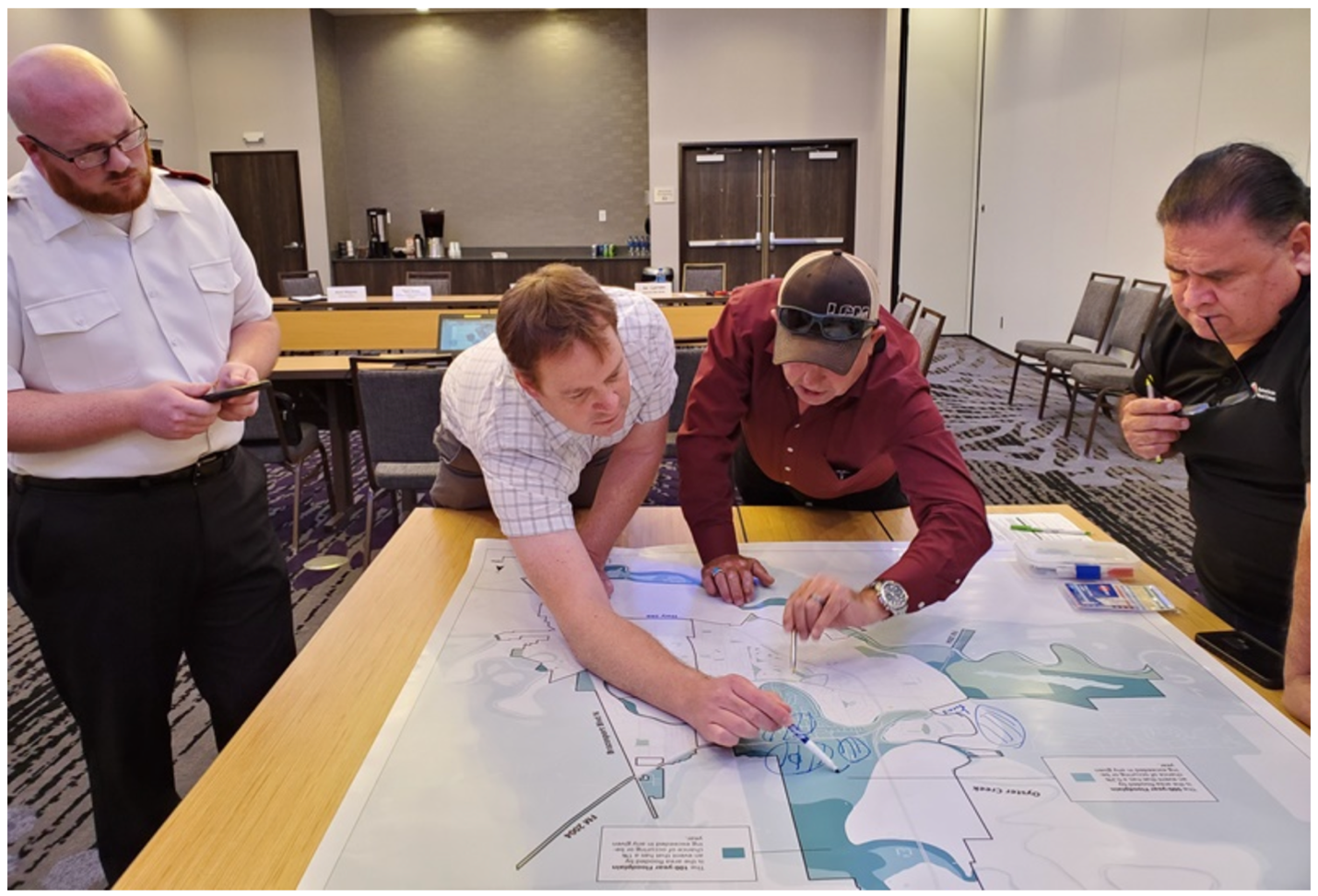
Participants Engaging in a Map Exercise Focus Group

Image from the Institute for a Disaster Resilient Texas (IDRT)
Key Takeaways
Study findings show that while the DP map offers promise, people view the FEMA map to be slightly more accurate than the DP map, although this difference could be because the public is likely more familiar with the FEMA map (i.e., the FEMA flood maps are found in homeowner documents, or appear on local news). Interestingly, the perceived usability of both of these types of flood maps — defined as the degree to which people believe the maps are easy to understand and can help them prepare for floods — is the strongest driver behind people’s accuracy ratings, even when considering other factors such as prior flood damage experience, living inside/outside the 100-year floodplain, renter/owner status of current home, and yearly household income.
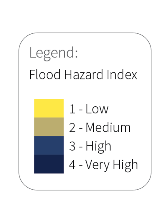
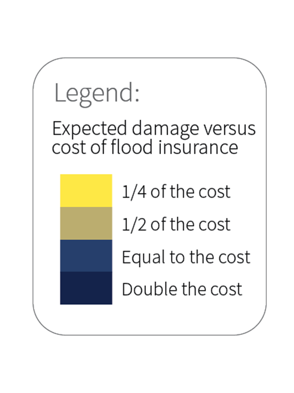
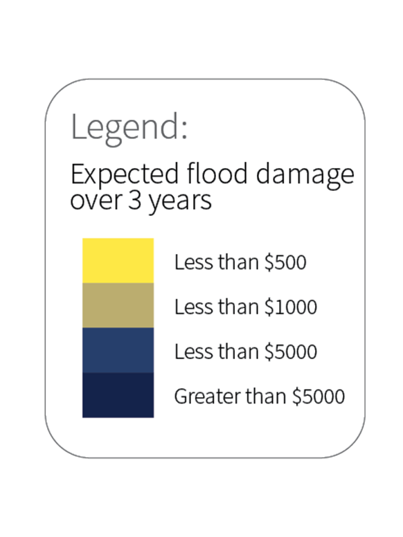
We also found that among three different map legends, the Flood Hazard Index (FHI) has the highest usefulness score across all participant groups. This finding suggests that people — whether they are currently living in a flood hazard area or have endured flood damage in the past — favor using a rating system with descriptive yet simple words (e.g., 1 – Low) more than fractions (e.g., expected flood damage will be ¼ of the cost of flood insurance) and dollar amounts (e.g., expected flood damage over 3 years will be less than $500). Future studies should try to pinpoint how legend information can influence people’s understanding of risk as well as their decisions around flood mitigation.
Three Map Legends Tested in This Study


Image from Stephens, K. K., Blessing, R., Tasuji, T., McGlone, M. S., Stearns, L. N., Lee, Y., & Brody, S. D. (in press). Investigating ways to better communicate flood risk: The tight coupling of perceived flood map usability and accuracy. Environmental Hazards. https://doi.org/10.1080/17477891.2023.2224956
Methodology
Texas residents5 living in two Greater Houston Area counties — Fort Bend and Montgomery6 — were asked to complete an online survey. At the start of the survey, participants could provide their physical address, whereby they were shown a map that displayed roughly 2 miles around their home. Participants were randomly presented with one of the two interactive maps — either the FEMA Floodplain map or the DP map7 — followed by whichever of the two maps they did not initially view, and they were not told the origin or creator name for either of the two maps. The survey items were then presented in the following order:
- Perceived accuracy of each map (e.g., “This map accurately identifies areas that frequently flood in my neighborhood.”)
- Perceived usability of each map (e.g., “The flood information on this map is easy to understand.”)8
- Prior flood damage experience (i.e., “How many times has your current home been damaged by a flood while you have lived there?”)9
- Usefulness of three types of map legends10
- Flood Hazard Index (FHI)
- Expected damage versus cost of flood insurance (DvsI)
- Expected flood damage over 3 years (D3years)
This research is only the beginning of our teams’ work around how to better communicate flood risk to different audiences, especially those who are not experts in hydrology. It was funded by a grant from the Texas General Land Office (GLO), Institute for a Disaster Resilient Texas (IDRT), and Technology & Information Policy Institute (TIPI).
References and Additional Information
1. Changnon, S. A. (2008). Assessment of flood losses in the United States. Journal of Contemporary Water Research & Education, 138(1), 38–44. https://doi.org/10.1111/j.1936-704X.2008.00007.x
2. Galloway, G. E., Reilly, A., Ryoo, S., Riley, A., Haslam, M., Brody, S., Highfield, W., Gunn, J., Rainey, J., & Parker, S. (2018). The growing threat of urban flooding: A national challenge. University of Maryland, Center for Disaster Resilience, and Texas A&M University, Galveston Campus, Center for Texas Beaches and Shores. https://today.tamu.edu/wp-content/uploads/sites/4/2018/11/Urban-flooding-report-online.pdf
3. Highfield, W. E., Norman, S. A., & Brody, S. D. (2013). Examining the 100-year floodplain as a metric of risk, loss, and household adjustment. Risk Analysis, 33(2), 186–191. https://doi.org/10.1111/j.1539-6924.2012.01840.x
4. Bell, H., & Tobin, G. (2007). Efficient and effective? The 100-year flood in the communication and perception of flood risk. Environmental Hazards, 7(4), 302–311. https://doi.org/10.1016/j.envhaz.2007.08.004
5. A total of 538 Texas residents began the online survey. Upon removing respondents who had only completed less than 30% of the survey, 404 Texas residents were included in this sample — 54.7% (N = 221) of the residents lived within the 100-year floodplain, and 45.0% (N = 182) lived outside of the 100-year floodplain.
6. Fort Bend and Montgomery counties were selected for this study because they were severely affected by the 2016 flood events. Residents living in these two counties were able to report whether they had gone through flooding in the past as well as more precisely judge the accuracy of the two flood maps.
7. The FEMA Floodplain map uses both the 100-year and 500-year floodplain designation, and the DP map uses a 50-year, 100-year, 250-year, and 500-year flood hazard area. Participants were explained the probability of being flooded over a 10-year period (i.e., for the FEMA Floodplain map: 100-year = 10% chance and 500-year = 2% chance; for the DP map: 50-year = 18% chance, 100-year = 10% chance, 250-year = 4% chance, and 500-year = 2% chance).
8. Perceived accuracy and perceived usability of the two maps were measured on a 5-point Likert-like scale (1 = Strongly disagree to 5 = Strongly agree).
9. Prior flood damage experience was measured using the following scale: 1 = never flooded, 2 = flooded once, 3 = twice, 4 = flooded 3-5 times, 5 = flooded 6-10 times, and 6 = flooded more than 10 times. Flood damage experience was dichotomized in this study because the number of participants who reported experiencing any level of flood damage in the past (N = 97) was large enough to be meaningful.
10. Usefulness of three types of map legends was measured on a 5-point Likert-like scale (1 = Not at all useful to 5 = Extremely useful).
